Katalyst Brewing Company
Project
2017
What I did
- Ideation
- Logo design
- Art direction
Symington Saison Branding
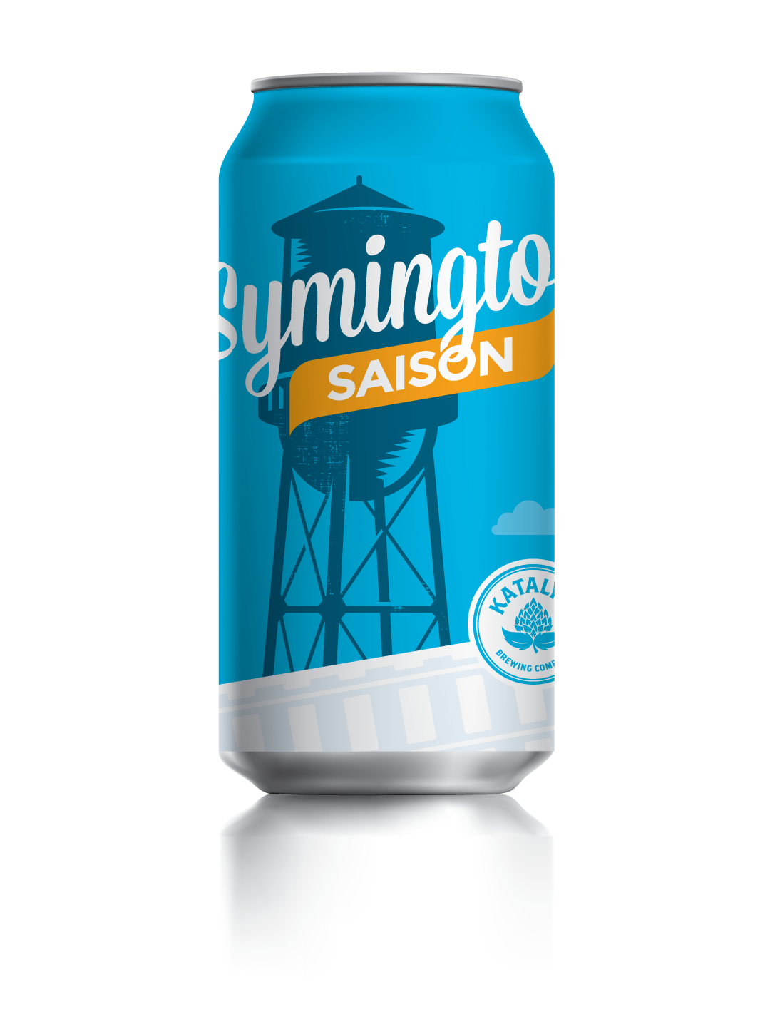
As a craft brew enthusiast, it was a goal of mine to work with a craft brew startup to help develop their brand and beer can design. I got that chance with Katalyst Brewing – a Toronto based startup established in 2016. Working closely with Katalyst we developed a design concept that reflected the Junction neighbourhood of Toronto – a rapidly changing area with a rich history. Below are examples of the final look and feel of the brand.
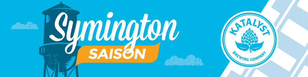
Beer Label Design
The final design features the water tower, a well known landmark in the Junction neighbourhood as the main focal point, along with a diagonal set of stylized train tracks to pay homage to the areas industrial and manufacturing history.

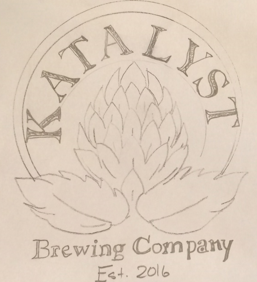
Katalyst logo
The Katalyst logo was also created with this project. Katalyst would act as a parent brand and was positioned as a secondary element. The circle style logo was designed to be subtle and versatile as it was meant to be a consistent mark for all future can designs. The logo itself is built around a stylized hop.
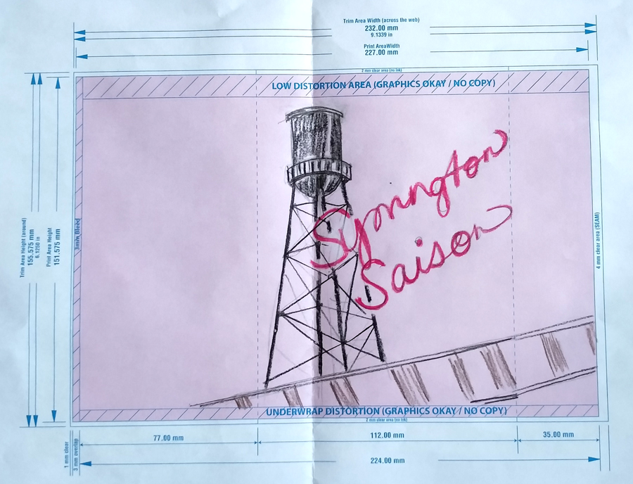
Original Concepts
Rough sketches used to help guide the final designs.
COLOUR
The colour scheme was created to invoke feelings of a hot summer day – complimentary imagery to accompany a saison style beer.
#00b3e3
#005d83
#ffa400