Mozilla
Project
2016
What I did
- Ideation
- Art Direction
- Design Layout
Mozilla CalTrain Wrap
I was given the opportunity to work on a unique project while working for Mozilla, different from my usual digital-focused work. In late 2015, Mozilla was looking to experiment with some non-traditional (from a tech stand point) forms of advertising, train wraps. So, I was excited to be able to see my work in the real world. Myself, along with a writer and creative director worked on some ideas to further amplify Mozilla as an advocate for the internet. The idea was to go bold in order to catch attention and get people thinking. Below are examples of what the finished concept was and some of the earlier visual concepts.
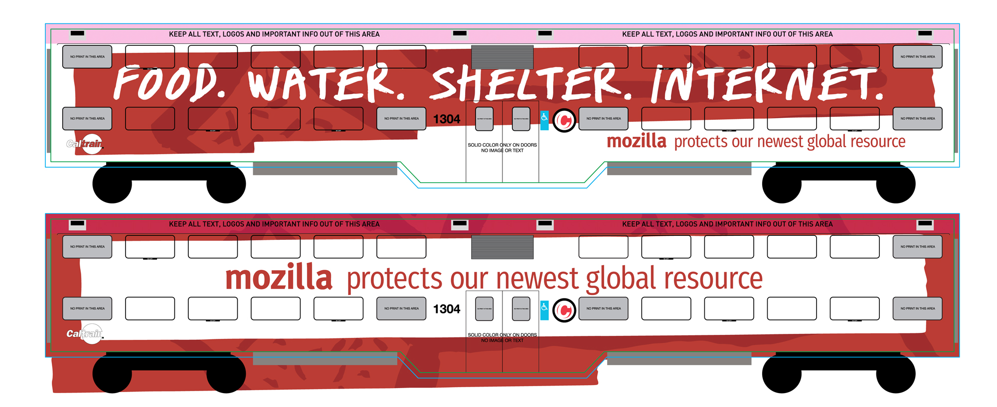
FINAL LAYOUT
This is a screenshot of the final visual layout used. The concept is meant to be appear bold and scrappy looking.
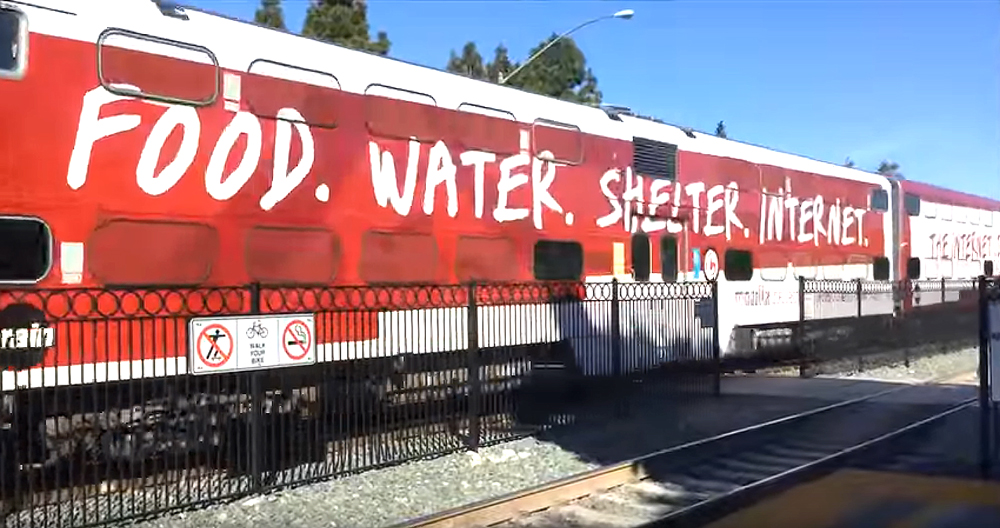
IT'S LIVE!
Image of the final design in the real world. Having worked in the digital world for so long, it was nice to see it this way.
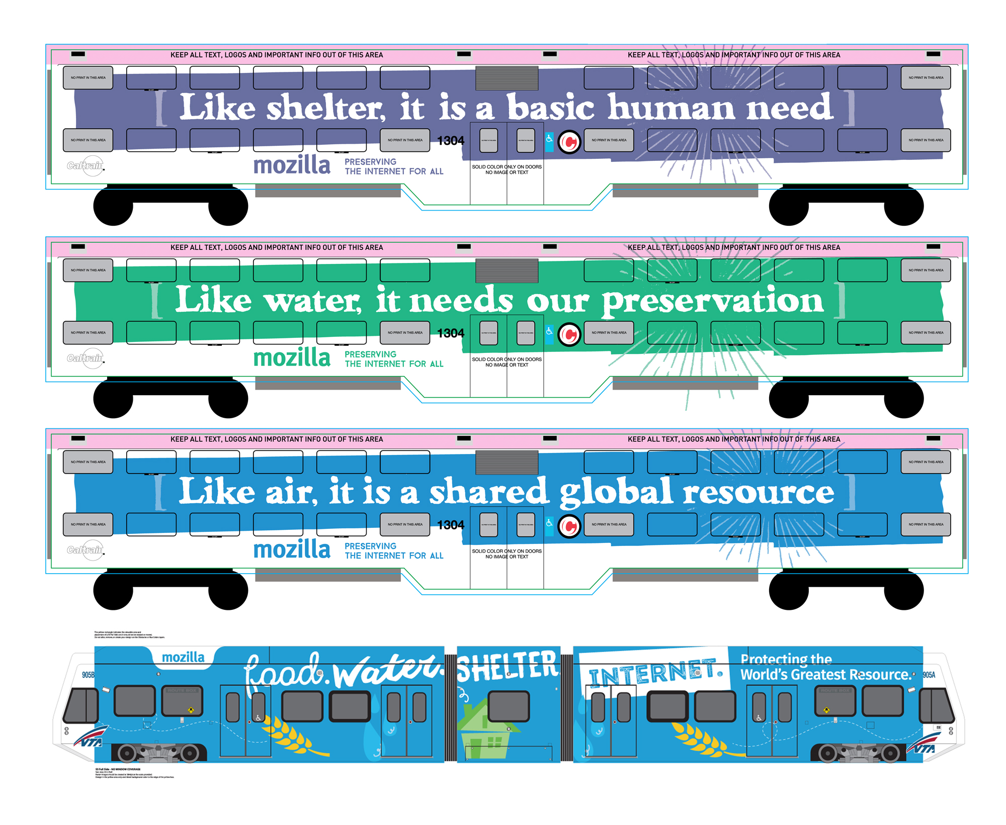
ALTERNATE DESIGNS
We played around with a variety of concepts and designs. Here are a few that almost made it, but not quite. We thought it was important to stick with our core brand colour – red, since this was a unique setting for a Mozilla message.