Dia Bondi in collaboration with Watt + Howe
Project
2018
What I did
- Ideation
- Logo design
- Style guide
Dia Bondi Branding
Working as a contract designer, I was given the opportunity to work with Watt + Howe to create a visual identity for Dia Bondi. Dia is an accomplished speaking coach with 20 years experience helping CEOs, philanthropists, visionaries and innovators to leverage crucial communications moments. Working closely with Dia and Watt + Howe, the goal of the rebrand was to find a unique and professional way to visualize her personality. The final result was a bold wordmark, pattern and iconography system that we nicknamed, ‘Modern Magic’. Modern Magic incorporated subtle elements of alchemy design in a clean setting. The alchemy concept was born out of the idea that Dia’s unique coaching style is a catalyst for excellence.
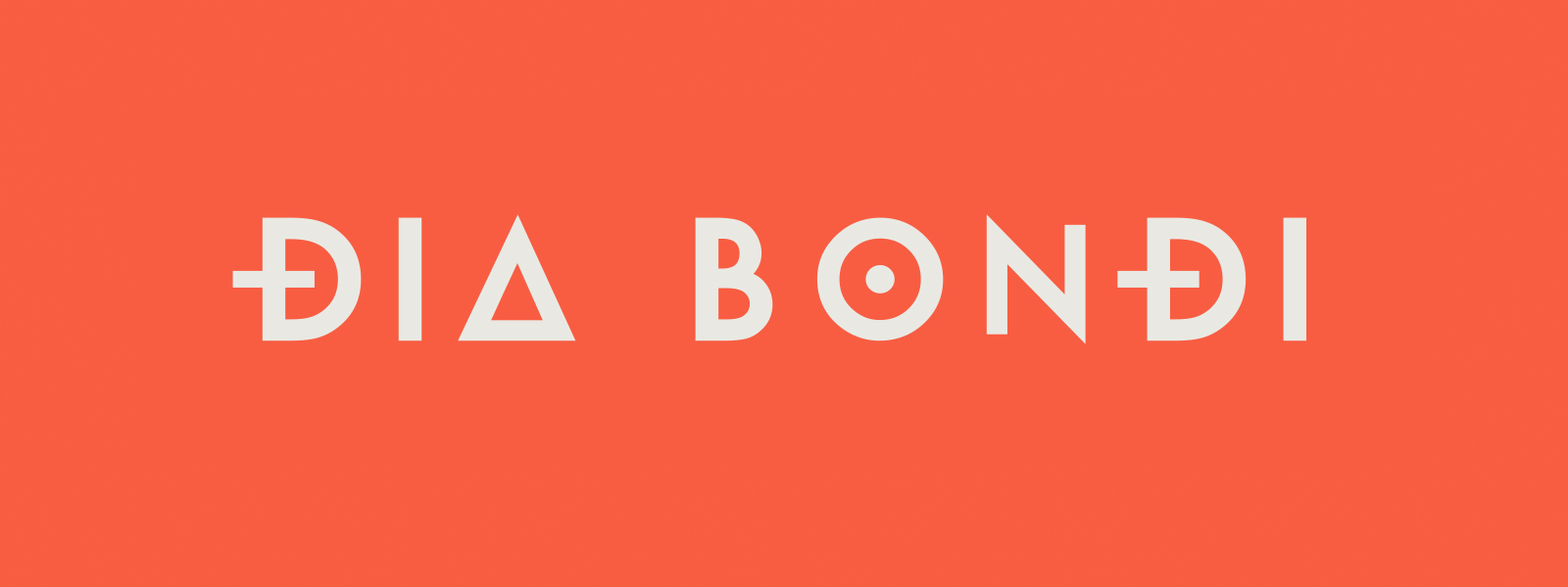
PRIMARY LOGO
Dia’s wordmark design was built from a Futura style font with the addition of various alchemy inspired accents, specifically on the ‘D’s’, ‘A’ and ‘O’. We felt this gave off a cryptic feel, offering a bit of the magical intrigue we were going for with the overall concept.
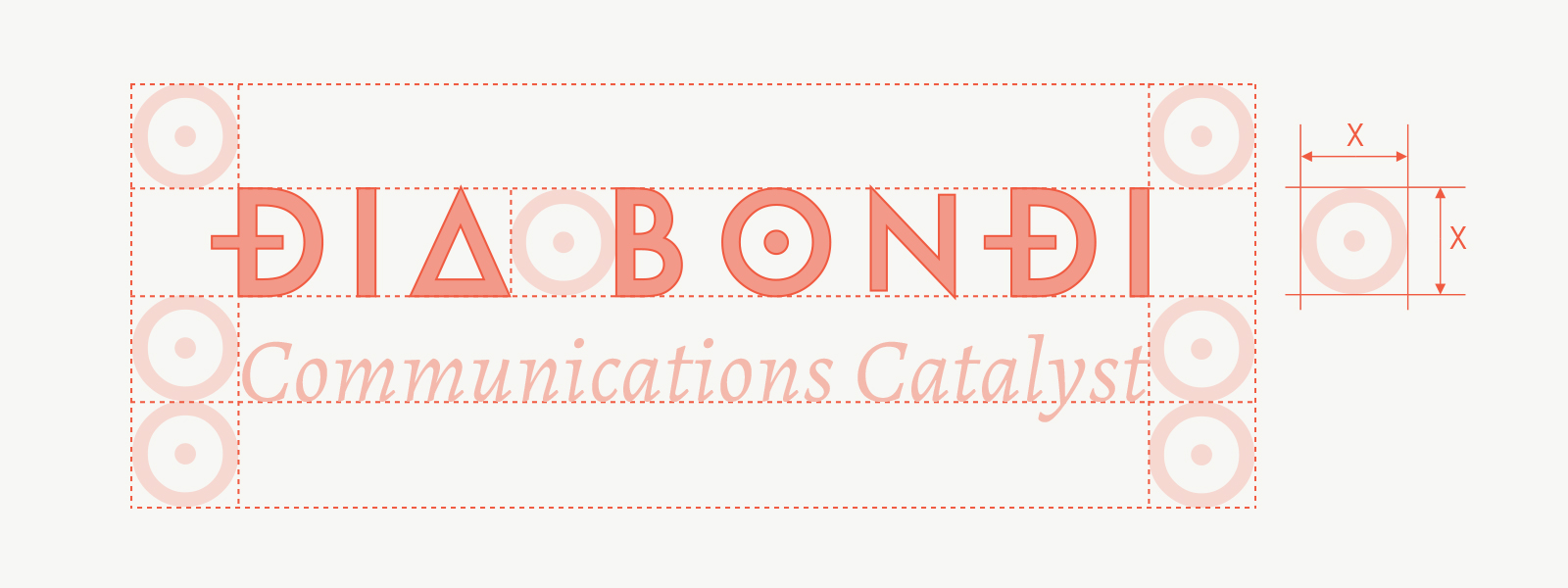
LOGO CONSTRUCTION
The logo was constructed using the ‘O’ as the reference for clearspace scaling. In some instances of the logo, Dia’s tagline ‘Communications Catalyst’ sits squarely below at the baseline of the ‘O’ reference point.
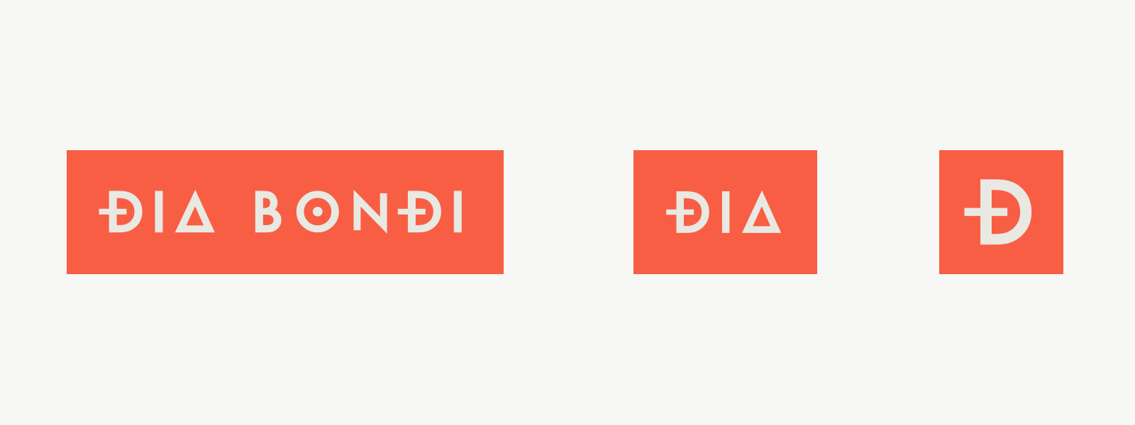
RESPONSIVE LOGO
The logo was created with responsive use cases in mind. We felt comfortable reducing the ‘Dia Bondi’ mark down to ‘Dia’ since we felt her first name was unique enough to stand alone. It also retained some of the key alchemy accents to look closely connected to the original. The logo is further reduced to just the ‘D’ for things like app icons or favicons.
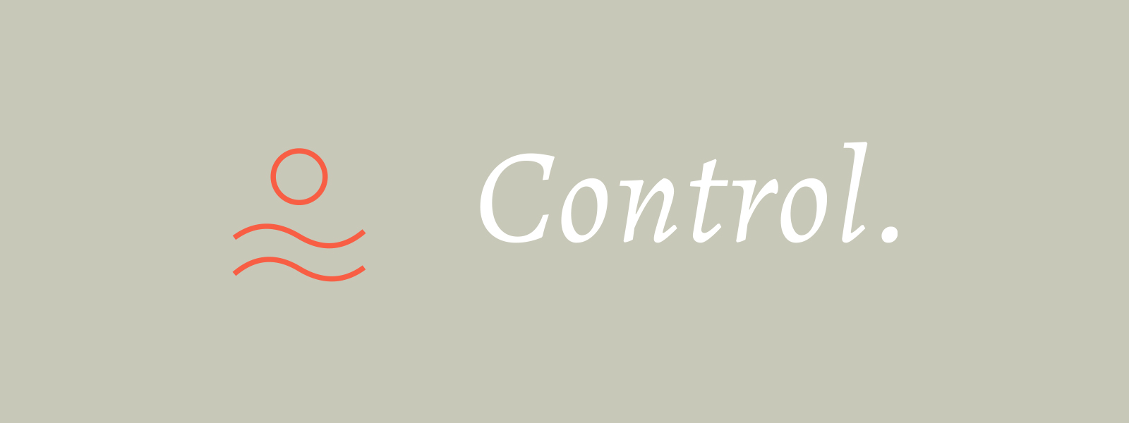
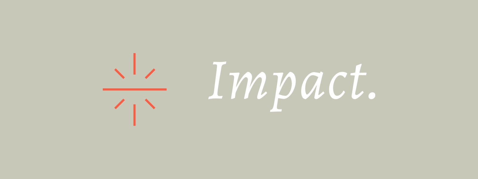
ICON DESIGN
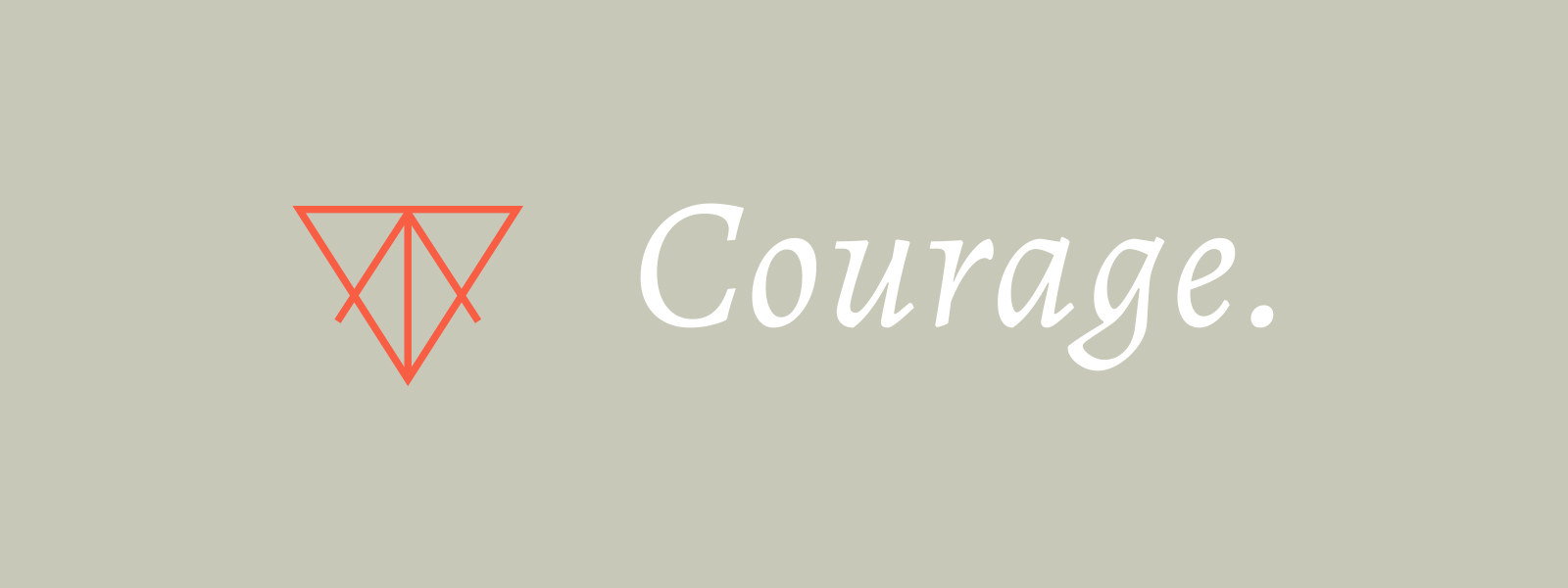
Three unique icons were designed to represent Dia’s core pillars – Courage, Control, Impact. Each icon was designed to further emphasize the alchemy feel of the brand.
COLOUR + TYPOGRAPHY
The primary colour palette chosen for Dia were a warm coral and a neutral grey, that we dubbed as Coral and Concrete. We felt these two had a bold energy together which reflected Dia’s personality. A teal and charcoal grey were added to the mix as accent colours.
#F85E44
#C8C8B8
#079399
#405052
Alegreya Italic
Headline
A B C D E F G H I J K L M N O P Q R S T U V W X Y Z
a b c d e f g h i j k l m n o p q r s t u v w x y z
Alegreya Regular
Body
A B C D E F G H I J K L M N O P Q R S T U V W X Y Z
a b c d e f g h i j k l m n o p q r s t u v w x y z
Rajdhani Semibold
Secondary
A B C D E F G H I J K L M N O P Q R S T U V W X Y Z
a b c d e f g h i j k l m n o p q r s t u v w x y z