StartupWaterloo.ca
Project
2018
What I did
- Branding
- Illustration
Startup Waterloo Branding
The StartupWaterloo rebrand was a project myself and creative collaborator, Jordan Jocius, took on as a way to showcase the Waterloo Region’s many founders, creators and changemakers. The brand is anchored by a website devoted to sharing short videos and personal stories of the rapidly emerging tech ecosystem. We felt a full rebrand and a unique separation from the Startup Canada umbrella was necessary to provide the vibe we were looking for. Below are some examples of the logo design as well as an experimental greeting card.
PRIMARY LOGO
The Iron Bridge W pays homage to Waterloo Region’s engineering past as well as a nod to it’s future. We felt that the idea of an iron bridge would strike a perfect balance between the ongoing transition of it’s past, present and future. The region itself is still home to 20+ iron bridges.
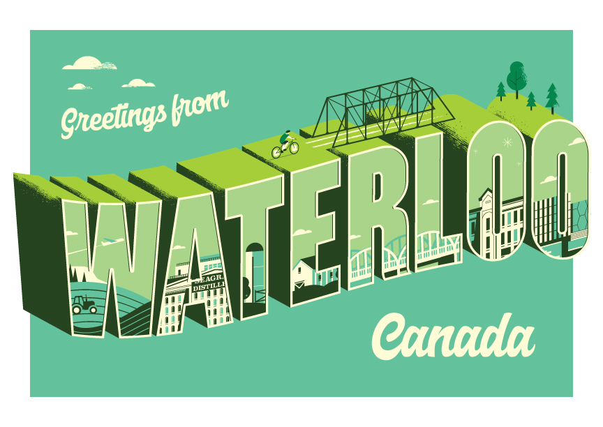
Greeting from
Waterloo Postcard
Postcard concept designed to help promote the region. The goal was to have a whimsical ‘Greetings From’ style card, much like other regions around the world. We hadn’t seen one representing this region to date, so we thought we’d make one. 😀
Greetings from
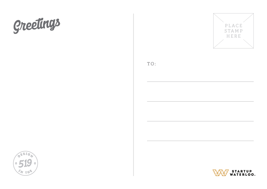
Waterloo Postcard backside
Functional side of the postcard. Nothing to see here, move along.
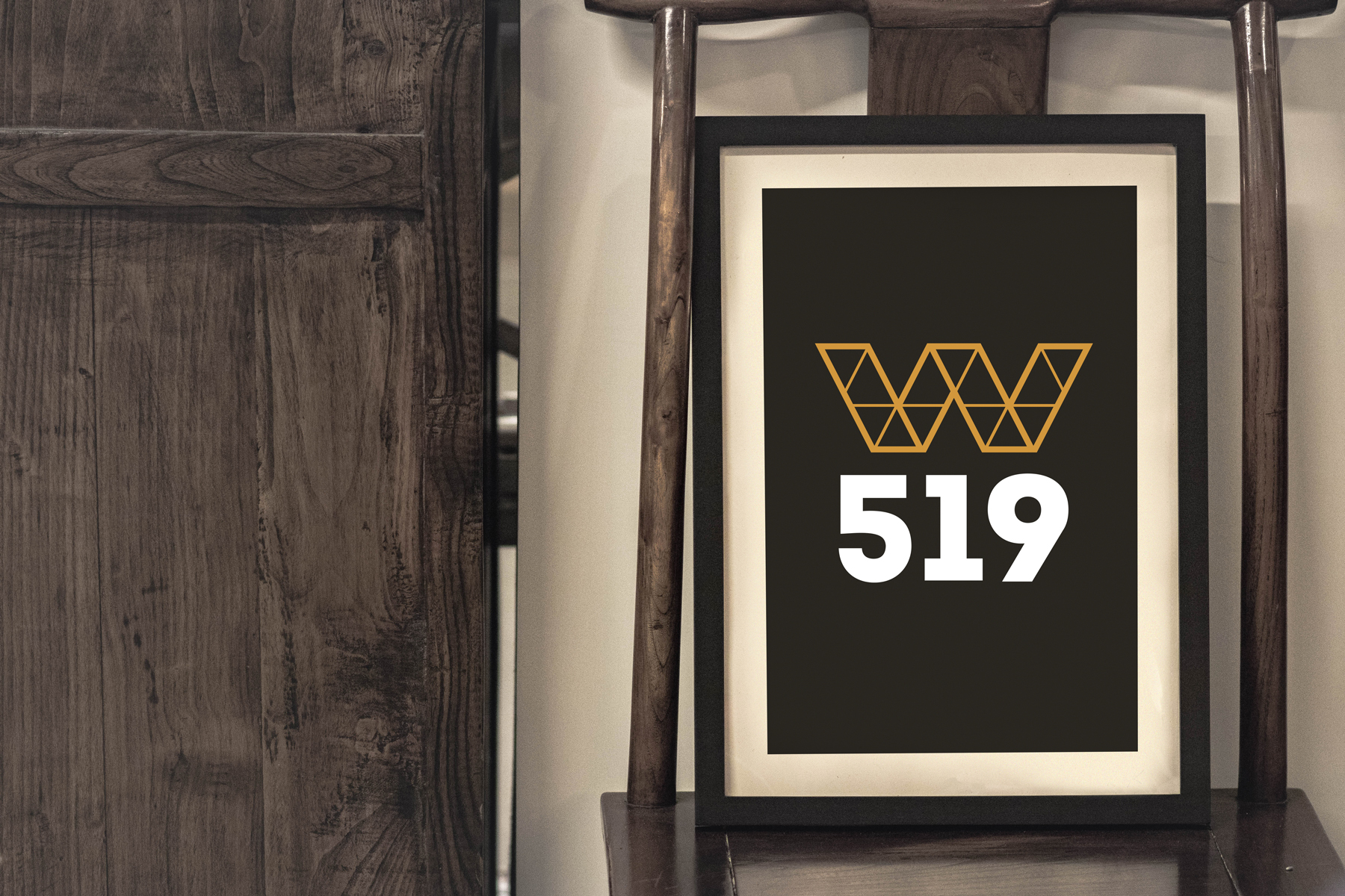
Design in the 519
Part of the brand vision was to create a simple motto that fellow creatives could get behind. That idea is the Design in the 519 – one of the main area codes for the region.
T-shirt design
Example of a t-shirt design meant to highlight the tri-cities of Kitchener, Waterloo and Cambridge. The three cities that primarily make up the Waterloo Region.
COLOUR
The core palette of the Startup Waterloo brand is a play off of one of the region’s key driving forces, the University of Waterloo, who also use a black and gold colour scheme.
#d2973c
#1c1919