Quikdo
Project
2014
What I did
- Branding
- Art direction
Quikdo Branding
Quikdo was a startup born in 2012, created by myself and three business partners. The idea was to create a Quick Service Restaurant solution for measuring the speed of service at various franchise locations. As the creative and marketing lead on my team, I was in charge of establishing the brand’s overall look and feel. Below are examples of the final identity.
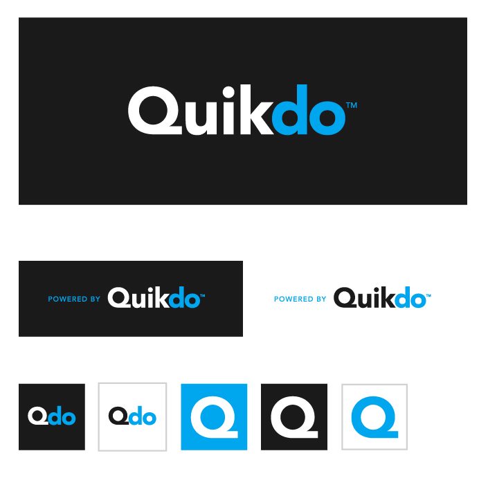
PRIMARY LOGO
This is an example of the final logo, along with an animated element which was designed to highlight the product’s sensor technology. The name Quikdo was meant to emphasize the company’s target industry with ‘Quik’ and the product’s goal of providing actionable data with ‘do’. Due to the quirkiness of the name itself we felt it was important to visually separate into two syllables using a two colour palette to prevent any confusion over pronunciation.
SECONDARY
Here are examples of the logo on dark as well as secondary options, such as app icons and responsive versions.
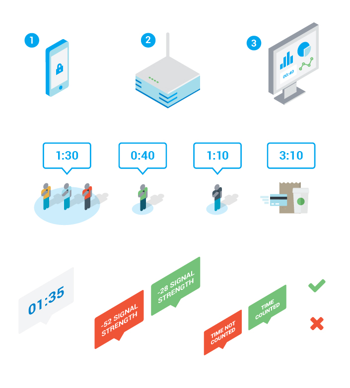
Pictograms
Various pictograms were designed to describe the products capabilities. An isometric look was used for consistency.
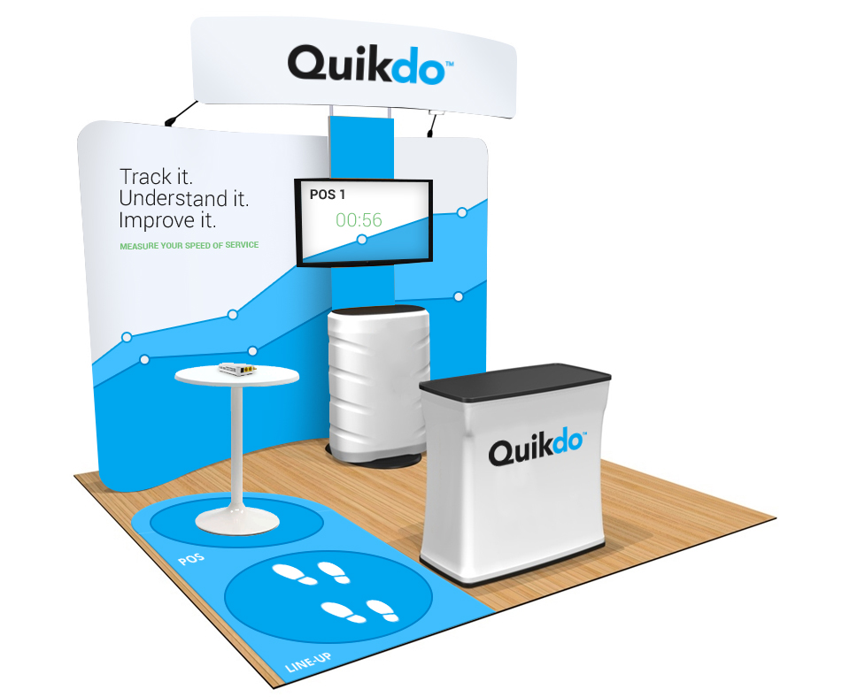
Trade-show booth
Trade-show booth concept for National Restaurant Association Show
COLOUR
A blue and dark charcoal was used as the primary palette, with a light silver and green used as accent colours where necessary.
#00a6ed
#1c1b1c
#dddfe0
#75c279