Project
2019
What I did
- Ideation
- Logo design
- Style guide
Tazza Branding
Working closely with my design team, Kollab, we were given a great opportunity to re-define and brand a 10 year old company, looking to modernize itself for the future of technology. Tazza is a Design consultancy specialized in marketing and new product development for forward thinking companies. Based on the name ‘Tazza’ which has a close association with coffee, we felt that it would be fitting to build a brand identity around the idea of energy, specifically our sun. To be a leading technology company you need to be a head of the curve, to be ahead of the curve, you need to be innovative. Tazza is for the early risers, looking to seize the day. The brand identity is nicknamed ‘Sunrise’ as a way to play off this vision. Below are a few examples of what Sunrise looks like.
PRIMARY LOGO
The wordmark is a modern san serif style font depicted in uppercase, to further emphasize a modern, advanced and powerful feel. The distinct focal point is the deliberate joining of the two ‘Z’s’ – which gives off an industrial and manufacturing feel – similar to a lift or steel beams. The icon acts as a complimentary symbol to the wordmark. It represents an early morning sunrise. The corner formation creates a stylized ‘T’ shape.


LOGO CONSTRUCTION
The wordmark was constructed using the ‘T’ as the reference for clear-space scaling. The icon is inspired by a rising sun, loosely forming a T-shape, created by the overlapping of a circle and square shape.


ALTERNATES
Here are a few examples of how the Tazza wordmark and icon can work on both dark and light backgrounds. In some instances the wordmark can stand separate from the icon.

BUILDING BLOCKS
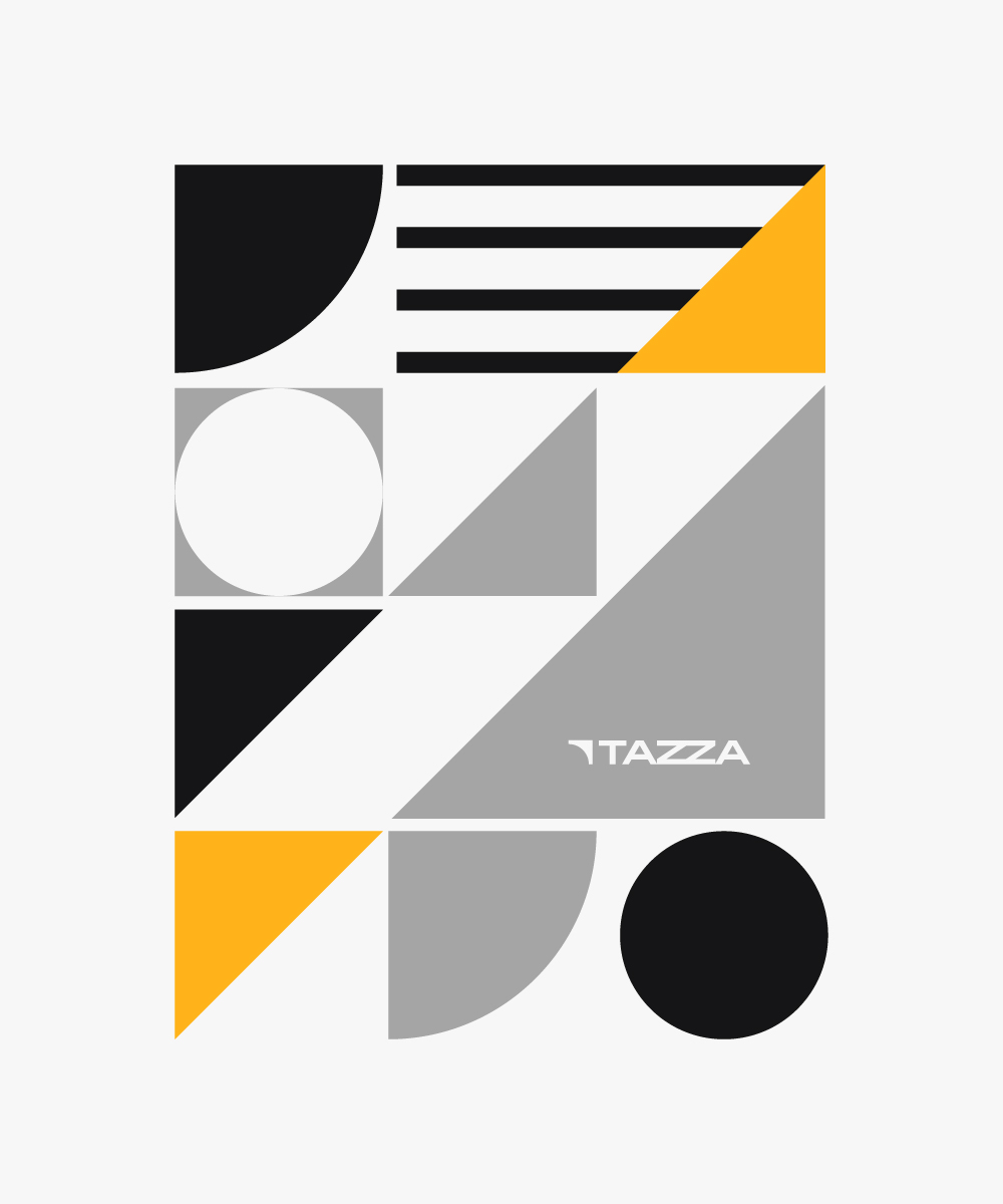
Geometric shapes offer a bold contrast to organic and humanistic photography, they are symbolic of building blocks, often associated with creating prototypes and proof of concepts at the early stages of an idea.

COLOUR
WHY YELLOW-ORANGE?: Tazza is all about energy. Symbolic of coffee and early morning sunrises. Yellow-orange is an intense colour and should be used sparingly, as a way to give life to the black and white colour scheme.
#FFB31A
WHY BLACK AND WHITE?: Black and White colour scheme is to allow for the work to shine through. Tazza acts as an umbrella brand which will ‘house’ subbrands. Since these subbrands are the heroes, we felt it makes sense to give Tazza an overarching neutral feel – similar to why photographers use a black and white colour scheme – it allows their work to be the focal point. Black & white also has a natural connection to coffee.
#151516
#A5A5A5
#F7F7F7
#2B2B2B

